

Categories
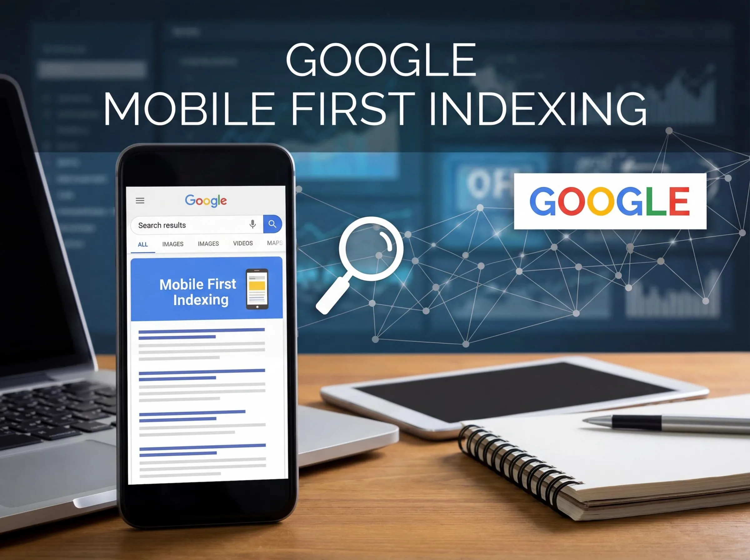
What is Mobile-First Indexing?
I’ll never forget the discussion I had with a client around 10 years ago about a site we were redesigning. My comment to them was Google Analytics indicated their clients were accessing the site at about 15% of the time, and that number was only going to increase. The comment back was basically, “we’ll just build for computers. Phones will never be that important.” Oh, how wrong they were!
That experience taught me something crucial: mobile-first indexing isn’t just another SEO buzzword. It’s a fundamental shift in how Google sees and evaluates your website. And if you’re still thinking desktop-first in today’s world, you’re already behind.
Understanding Mobile-First Indexing: The Basics
So, what is mobile-first indexing exactly? In the simplest terms, mobile-first indexing means Google predominantly uses the mobile version of your website’s content for indexing and ranking. Before this shift (which seems like ancient history now), Google’s crawlers primarily looked at your desktop site to determine how your pages should rank in search results.
Think about that for a moment. Google essentially flipped the script entirely.
Here’s what changed: instead of crawling your desktop site and occasionally checking the mobile version, Google now crawls your mobile site first—and in many cases, exclusively. Your desktop site? It’s become secondary. This brings to mind a conversation I had with John Mueller from Google at a conference. He put it bluntly: “If your mobile site doesn’t have the content, Google doesn’t know about it.”
Why Google Made This Move
The reasoning is straightforward when you consider user behavior. More than 60% of all Google searches now happen on mobile devices. Google’s job is to provide the best results for its users, and if most of those users are on phones, it makes perfect sense to prioritize the mobile experience.
Additionally, Google had been penalizing sites with poor mobile experiences through their mobile-friendly update (remember “Mobilegeddon” in 2015?). Mobile-first indexing was the natural evolution of that philosophy.
What Mobile-First Indexing Actually Means for Your Website
Let me share a real-world example that illustrates this perfectly. A cpmpany with a B2B software company that had invested heavily in their desktop site. They had detailed product descriptions, comprehensive comparison charts, white papers, case studies—the works. Their mobile site, however, showed abbreviated content with many features hidden behind accordion menus or omitted entirely.
When Google switched them to mobile-first indexing, here’s what happened:
- Rankings dropped for product-related keywords because the full product descriptions weren’t on the mobile site
- Organic traffic declined by 34% within two months
- Lead generation suffered as fewer people discovered their detailed resources
The fix required making the mobile experience as comprehensive as desktop—not easy, but absolutely necessary.
Key Elements Google Evaluates
When Google’s crawler visits your mobile site, it’s looking at several critical factors:
- Content parity: Does your mobile site have the same depth of content as desktop?
- Structured data: Are schema markups present and identical across both versions?
- Metadata: Title tags, meta descriptions, and heading tags should be consistent
- Visual content: Images and videos need to be accessible and properly optimized
- Page speed: Mobile loading times matter more than ever
- Usability: Navigation, button sizes, and overall user experience
Here’s another example. A customer in the hospitality industry whose mobile site used lazy-loading for images—which sounds smart, right? Except their implementation prevented Google from seeing half their visual content. Their image search traffic virtually disappeared.
Common Misconceptions About Mobile-First Indexing
There’s considerable confusion around what mobile-first indexing actually does. Let me clear up a few things:
Misconception #1: “Mobile-first indexing means Google has separate mobile and desktop indexes.”
Not true. Google maintains one index. They just primarily use the mobile version of your content to populate that single index. Your desktop site still matters, but it’s no longer the primary reference point.
Misconception #2: “If I have a responsive website, I’m automatically fine.”
Mostly true, but not always. Responsive design is definitely the easiest path to mobile-first success because your content is identical across devices. However, if you’re hiding content, using different structured data, or have performance issues on mobile, you could still face problems.
Misconception #3: “Mobile-first indexing means mobile rankings are different from desktop rankings.”
Again, not quite. Remember, there’s one index. However, because Google evaluates your mobile experience to determine rankings, and because mobile and desktop search results can show different features (like local packs, featured snippets, etc.), you might see variations in how and where you rank.
Making Your Website Mobile-First Ready
This brings me to the practical question: what should you actually do? I’ve developed a fairly straightforward checklist through years of helping clients navigate this transition.
Conduct a Mobile Content Audit
Pull up your desktop site and your mobile site side-by-side. Seriously, do this right now if you haven’t. Compare them carefully:
- Is any content missing from mobile?
- Are images, videos, and infographics all visible?
- Can users access the same navigation and internal links?
- Are forms and interactive elements fully functional?
When we did this for an e-commerce client, we discovered that product reviews (a crucial ranking factor for them) weren’t displaying on mobile. That single oversight was costing them dearly.
Optimize for Mobile Speed
Page speed on mobile is non-negotiable. I can’t stress this enough. Google’s Core Web Vitals—which include metrics like Largest Contentful Paint, First Input Delay, and Cumulative Layout Shift—are measured primarily on mobile now.
Use Google’s PageSpeed Insights tool to identify specific issues. I have a client that when I took over their site, their mobile site was loading in 16 seconds due to unoptimized images, custom programming and terrible hosting. After optimization (reducing image sizes, implementing lazy-loading correctly, and move to the BeBizzy server), they cut load time to under 3 seconds. Their bounce rate dropped by 42%, and time-on-site increased significantly.
Ensure Structured Data Consistency
This is where things get technical, but bear with me. If you’re using Schema markup on your desktop site to help Google understand your content (products, recipes, events, FAQs, etc.), that same markup must exist on your mobile site.
I’ve seen situations where developers implemented rich snippets only on desktop, assuming mobile was “too cluttered” for such details. When mobile-first indexing kicked in, those rich snippets disappeared from search results entirely. The impact on click-through rates was immediate and painful.
Test Your Mobile Usability
Google Search Console has a fantastic Mobile Usability report that flags issues like:
- Text that’s too small to read
- Clickable elements too close together
- Content wider than the screen
- Viewport not properly configured
Run your site through this report regularly. Additionally, use Google’s Mobile-Friendly Test tool for individual pages. And honestly? Just use your own site on your phone. You’d be surprised how many issues you’ll catch simply by navigating as a real user would.
A Personal Reflection
I’ll be honest: the transition to mobile-first forced me to confront some of my own biases. I’m someone who does most deep work on a laptop with a large monitor. For years, I optimized primarily for that experience because it was my experience. Mobile felt secondary—something to “make work” after perfecting the desktop version.
But the data doesn’t lie. Most people interact with most content on mobile devices. If I’m not designing for that reality, I’m designing for a minority use case. That’s a humbling realization, but an important one.
Looking Forward: What Comes Next?
Mobile-first indexing is now the norm, but what’s on the horizon? Google continues to push toward what some are calling “mobile-only” indexing—where the desktop site becomes almost irrelevant. We’re already seeing this with newer sites that Google has never crawled via desktop.
Additionally, with the rise of voice search, wearables, and other smart devices, the very concept of “mobile” is evolving. Are you ready for a watch-first index? A voice-assistant-first index? These might sound far-fetched, but so did mobile-first back in 2016.
Your Action Plan
If you’re feeling overwhelmed, start here:
- Check your Search Console to see if Google has already switched your site to mobile-first indexing (they probably have)
- Run a comparative content audit between desktop and mobile versions
- Test your mobile site’s speed and usability
- Verify your structured data appears on both versions
- Monitor your rankings and traffic for any mobile-related drops
One question I often get: “Is it too late to optimize for mobile-first?” Absolutely not. While Google has mostly completed the rollout, improving your mobile experience will always benefit your rankings, user engagement, and conversions. Better late than never.
Final Thoughts
Mobile-first indexing fundamentally changed the SEO landscape, but at its core, it’s really about alignment. Google is aligning its ranking methodology with how people actually use the web. As website owners, marketers, and content creators, we need to align our strategies with that same reality.
The client I mentioned at the beginning—the one whose rankings tanked? Their mobile experience was rebuilt from the ground up. It took four months and wasn’t cheap. But within six months of the relaunch, they’d not only recovered their lost rankings but exceeded their previous traffic levels by 23%. More importantly, their mobile conversion rate improved because the experience was genuinely better.
Here’s my challenge to you: Pull out your phone right now and navigate your own website as if you’re a first-time visitor looking for information. Is it fast? Is the content complete? Can you easily find what you need? If you’re hesitating on any of those questions, you know what needs to be done.
What’s been your experience with mobile-first indexing? Have you seen ranking changes, traffic shifts, or user behavior differences? I’d genuinely love to hear your stories—feel free to share in the comments below. We’re all navigating this evolving landscape together, and there’s always more to learn.
Contact BeBizzy Consulting today to help you if your website needs some help with responsive design, mobile-first indexing, or just some help with the audit or other technical fixes.