

Responsive Web Design
What is responsive website design?
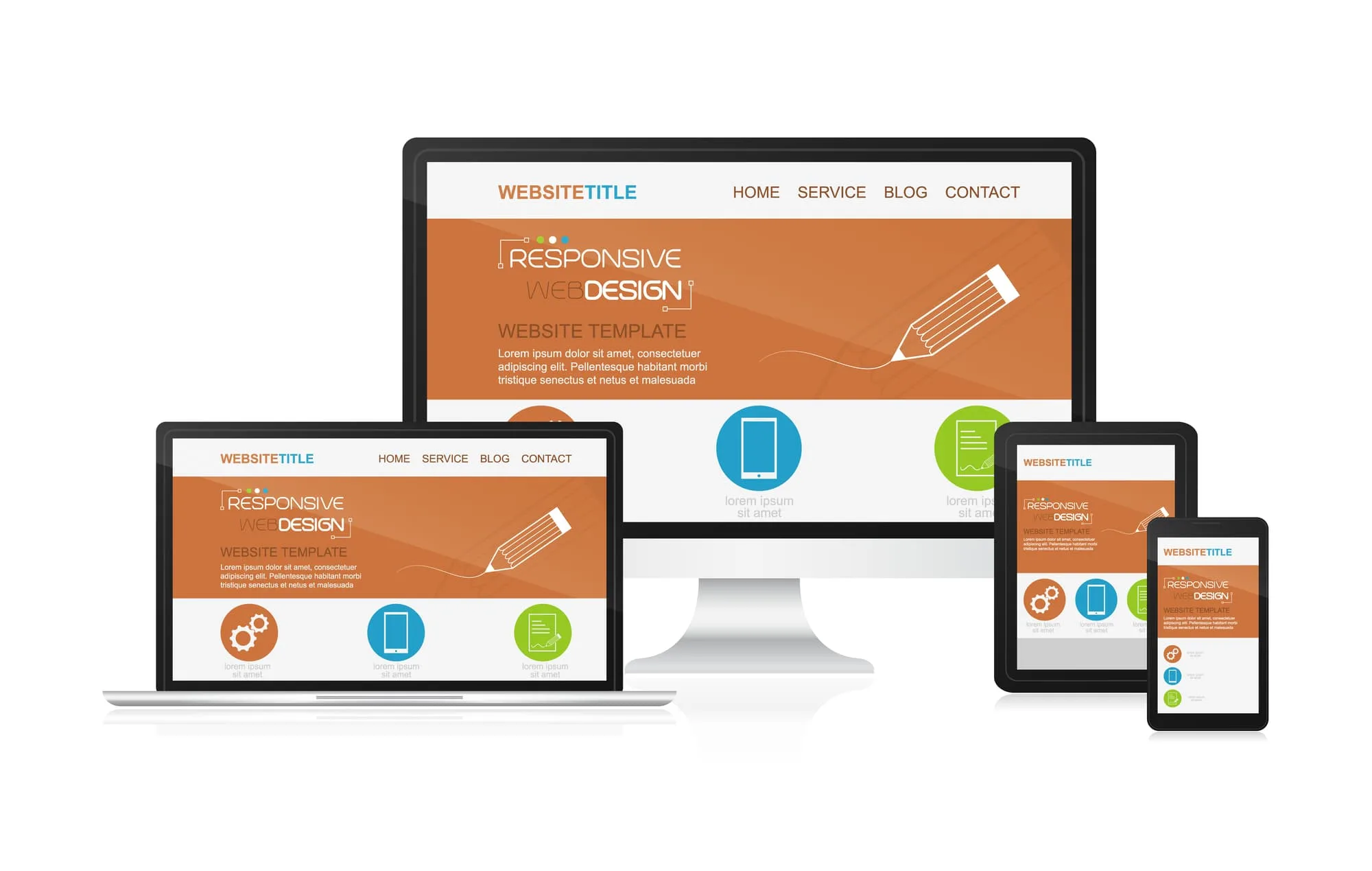
Responsive web design is all about creating websites that adapt and look good on any device—whether someone’s browsing on a desktop, tablet, or smartphone. Instead of having separate sites for each type of device, responsive design uses flexible layouts, scalable images, and smart CSS media queries to ensure your website is user-friendly and visually appealing no matter where it’s being viewed.
Think about your customers: they’re not always at a desk. They might be checking things on their phones while commuting, scrolling through their tablets at a coffee shop, or working on desktops in their offices. Responsive design meets them right where they are. The layout shifts to fit the screen. The navigation adjusts seamlessly. Images resize appropriately. All the content stays accessible and easy to use, regardless of the device.
These days, it’s not just nice to have; it’s a must. Google has made it clear that if your site isn’t mobile-friendly, you’re going to struggle with visibility. Mobile-first indexing means Google looks at the mobile version of your site first when ranking it. If you’re not responsive, you’re basically missing out on a ton of potential traffic.
The Real Problems With Non-Responsive Website
If your website isn't responsive in 2026, you're turning customers away.
Here’s what goes down when your site doesn’t play nicely with mobile devices:
- Mobile users have a frustrating experience. They’re pinching and zooming just to read what you've got. Buttons end up being way too small to tap easily. Text becomes unreadable. Navigation feels impossible. So they bounce off your site faster than you can say "lost customer"—and head straight to a competitor's site that actually works on their phone.
- You’re losing out on traffic. More than 60% of web traffic comes from mobile devices these days. If your site isn't optimized for mobile, you're telling over half of potential customers to find another place to go.
- Google will penalize you. Poor mobile experiences mean your rankings will drop because Google sees those issues and decides your site doesn’t deserve top spots in search results.
- Your conversion rates take a hit. A clunky mobile experience translates to fewer form submissions, phone calls, and purchases—people simply won't bother interacting with a site that frustrates them.
- You come off as unprofessional and untrustworthy. When someone finds your business via their phone and sees an outdated or broken site, they start questioning whether you're a legitimate business. They’ll likely move on to someone who looks more credible.
- You lose local search visibility. Local SEO is super important, especially since people searching for services “near me” are usually doing so from their phones. If your site isn’t working properly for these users, you risk being completely invisible to those high-intent local customers.
- Your bounce rate skyrockets. Users arrive at your site, see it doesn’t work well on their device, and leave immediately. High bounce rates signal to Google that you aren’t meeting user needs—which can lead to lower rankings.
A non-responsive website can really hurt your business. You’re not just losing visibility; you're also damaging your reputation and bottom line.
How Responsive Web Design Makes Your Site Actually Usable
So what does solid responsive design look like?
- Flexible Grid Systems
The foundation of responsive design is all about flexible grids that scale based on screen size—no fixed pixel widths here! We use percentages and relative units so content flows smoothly whether someone’s using a big monitor or a tiny phone screen. - Fluid Typography
Text sizes adjust automatically for different screens—headlines are easy to read on mobile devices without needing zooming, while body text remains legible across all platforms. - Scalable Images and Media
Images and videos resize perfectly within their containers without messing up the layout or slowing down loading times. We utilize modern image formats and lazy loading techniques for speedy performance across all connections. - Smart Navigation
On desktops, navigation menus look one way; on mobiles? They morph into handy hamburger menus! Touch targets are sized just right for fingers—not mouse cursors—making the whole experience feel intentional rather than like an afterthought. - Touch-Friendly Interfaces
Interactive elements like buttons and forms are designed with touch interaction in mind—no more frustrated users trying (and failing) to tap tiny buttons! - Performance Optimization
Responsive sites load quicker over mobile networks because we tweak how assets are delivered based on what device is being used—a phone won’t need to download desktop-sized images! Faster loading times lead to better rankings and happier users overall. - Consistent Branding Across Devices
Your brand identity shines through consistently whether someone’s browsing on desktop, tablet, or phone—there's no fragmentation here; everything feels unified. - Mobile-First Architecture
Modern responsive designs start with the mobile experience first before adding complexity for larger screens—this ensures we focus on what truly matters for mobile users right from the get-go. - Accessibility for All
Done right, responsive design also means making sure everyone can use your site effectively through proper semantic HTML, keyboard navigation options, and screen reader optimizations. - Core Web Vitals Optimization
Responsive sites keep performance metrics in mind: fast loading times, smooth interactions, stable layouts—all factors that Google considers important when ranking websites.
Do these and you end up with a website that welcomes visitors no matter what device they're using—no frustration involved! Just an easygoing experience that helps convert visitors into customers.
Why You Need Professional Responsive Design
You may think responsive design is as simple as slapping on a “mobile-friendly” label—but there’s way more to it than that! There’s a huge difference between a site that's just functional on mobile versus one that's genuinely designed with mobile users in mind.
A professional responsive web designer will:
- Take an in-depth look at your current site and pinpoint specific issues related to responsive design.
- Craft an authentic mobile-first experience instead of merely adapting a desktop site.
- Test everything across real devices and browsers so you know it actually works.
- Optimize for Core Web Vitals alongside other performance metrics impacting rankings.
- Ensure accessibility standards are fully met.
- Build a future-proof architecture that can grow alongside your business.
- Connect improvements in responsive design directly to measurable outcomes for your business.
At the end of the day, remember this: Your website is often the first impression potential customers get of your business. If that impression happens while they're using their phone and your site looks broken or outdated? You’ve lost them before they even think about calling or visiting!
In today’s mobile-first world, responsive design isn’t just optional—it’s crucial! It can be the difference between being visible or completely lost among competitors when people are searching online for what you offer. Make sure your site actually works well for everyone trying to find you!